Which Way From Here?
Software is cheaper than ever. LLMs can churn out slop nobody asked for faster than you can say "thanks, but make it stop". This quantity-over-quality approach can embolden engineers who have their ego invested in flooding the zone with an inflated sense of the value of their proposals, at a real cost to tech organizations.
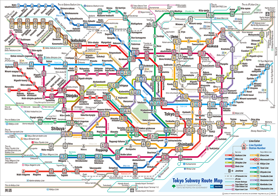
Before LLMs, we had the Architecture Diagram from Hell (ADH), which served a similar function. This Lovecraftian nightmare is ostensibly an effort to communicate the moving parts of a major software system, but often comes across as an inscrutable blur that more resembles the Tokyo Metro map than a working software system. Its complexity serves to inundate rather than educate.
Years ago, these diagrams took time to build, and perhaps precisely because of that did communicate details that mattered to somebody, somewhere; if you're going to invest your time, then by God, you're going to get your point across. But I find these kinds of diagrams are really only great if you already know where you are and where you're going.
OK, So What?
Both tendencies toward complexification, even if warranted by some real need for completeness (as in the real-world subway map's case), have costs for both humans and AI agents. More nodes mean more information for humans to parse, and more potential for agents to spin out of control, following paths to destinations we didn't intend them to discover.
So, what can we do about it?
The OODA Loop comes to mind as one framework for navigating this. John Boyd developed this concept as a U.S. Air Force fighter pilot and instructor. It began as a framework for aerial combat and was later formalized as a general model for decision-making under pressure.
The loop contains four cycles, repeating endlessly:
- Observe
- Orient
- Decide
- Act
Of these, special emphasis is placed on Orientation. This is essential to understanding the current moment: where you are and what the objective is. Only then can you decide and act with clarity.
Think back to the map. Were you searching for a circle or triangle with "You Are Here" emblazoned on it? Now think of your audience. Where would they put themselves on it? How can you orient them to the situation or task at hand? If the reader is an AI, how do you imagine it getting from A to B if it doesn't know where to start?
A Platform Revisited
Returning to software diagrams, when people ask me for feedback on decks, slides, documents, and diagrams, my first question is invariably "Who is the audience?" The answer sets the tone for the orientation you want to provide a particular reader.
Technical diagrams for engineers carry different priorities and perspectives than those intended for executive review. Show an exec a diagram with 100 nodes and edges and they will nod and smile (if you're lucky). Show them two boxes and an arrow and they might ask a question, if they can entertain the premise as an on-ramp of sorts. Questions mean they're engaged. Engagement means dialog and direction, a vector to someplace with promise.
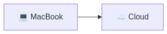
This comically simple diagram illustrates more than it lets on at first glance. I've talked here and there about building a local cloud platform out of commodity parts; now is when we start steering this toward the enterprise. At its core, that means providing users with secure, reliable access to something larger than their local laptop.
One Step Beyond
So, which way from here? A two-node diagram is not communicating anything sophisticated. Our next steps will be to give some direction and hints at the potential. At some point, we may lose the audience, but for now, we're still forking into any number of potential future destinations.
As an example use case, here's one way to express the next layer of detail: a writing setup I'm using to write this very post:
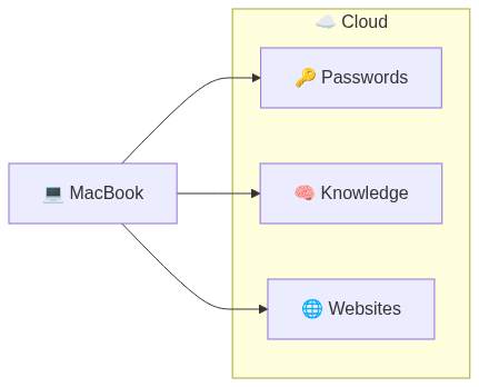
It still looks simple, but now we can see some possibilities. We can easily imagine we're writing marketing material, reading from our private IP and writing to some potentially public landing page. And we can just as easily imagine "websites" being anything from a landing page to a content management system.
One component is worth a note: "Passwords". These are the credentials that unlock everything else, and they get their own box because that access has to be automated and compliant, granted by the system instead of typed in by hand. In my case, a single scoped token unlocks Vault, and with it the rest of the stack.
None of these labels are fixed. "Cloud" was a placeholder; here it's a writing stack, but it could just as easily be a data pipeline, a storefront, or a research lab. What if we oriented ourselves around our earlier LLM playground?
LLM Playground Redux
The first post in this series already stood up exactly that: an LLM platform on a home gaming rig under the working title "Playground." That name undersold it. It's the same spine as the writing setup, a MacBook on the left and a box of compute on the right, now pointed at a heavier workload.
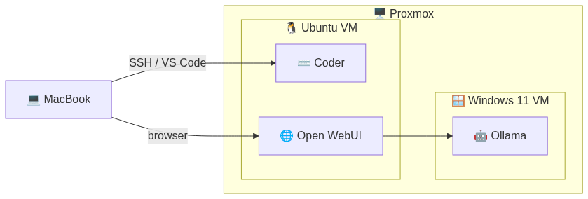
This diagram does something the ADH rarely manages: it justifies the complexity it shows. Every box is there because something runs in it. The Windows VM exists because GPU passthrough on Linux was more trouble than it was worth. The Ubuntu VM exists because Coder runs better there.
It answers the questions a well-designed block diagram should. Every node is a running system, not a team name or abstraction. The SSH and browser labels are entry points, not aspirations. The local-to-remote split makes the dependency chain explicit. Arrows show the actual, understandable traffic patterns.
In this series of posts, Proxmox manages the underlying workloads: VMs for isolation and GPU access, containers for everything else. Add a second GPU box, a service that has to come back on its own after a reboot, or a teammate who needs the same stack tomorrow, and Proxmox starts asking you to wire it all up by hand. The layer that absorbs that work is Kubernetes. Explaining why you need that added complexity, and showing how you keep it manageable, is the trick.
A Platform Reframed
Both diagrams above, the writing setup and the LLM platform, are cuts of the same idea. The same system supports more than one diagram. Each one is a valid snapshot, framed for a different reader. Think of it as a lens for reading glasses; everyone has their own prescription.
A client evaluating a platform doesn't care about the internals. An executive wants to know who owns it and whether it will add value. An engineer needs to see what part of the system they're working with and what upstream and downstream dependencies exist. Same architecture, different vantage points. The discipline is knowing which snapshot to share.
An Engineer's View of a Platform:
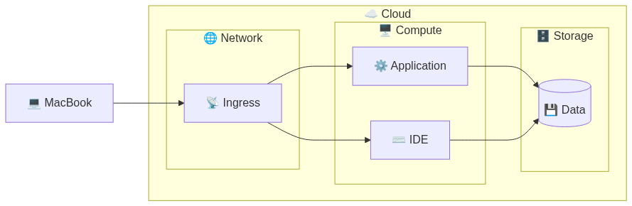
As you work through the layers, the snapshots tend to suggest themselves. Find yourself diving into diagrams to explain dashboarding? That's a front-end engineer's or data analyst's lens waiting to happen. Find yourself enumerating firewall rules? The network and policy governance team needs their own lens. Either way, you're doing the thing Boyd cared about most. You're getting oriented.
Putting It Together
Eventually a diagram has to show something properly complicated, and for this series that thing is Kubernetes. It has a reputation for complexity that it largely deserves. The mistake is thinking the diagram has to arrive all at once, every node present on first contact. That's the Tokyo map again, just with better branding.
You build up to it the same way you built up from two boxes. Start with what the reader already accepted, the MacBook and the box of compute, then add one node at a time and say why each one is there as you place it. A new service needs somewhere to run, so it gets a namespace. Three services can't fight over the same port or reach into the same secret drawer, so ingress routes traffic at the edge and shared storage sits underneath. That is successive approximation: you don't just draw the destination, you walk the reader right up to it.
Here's what the writing stack looks like once the infrastructure layer is drawn in:
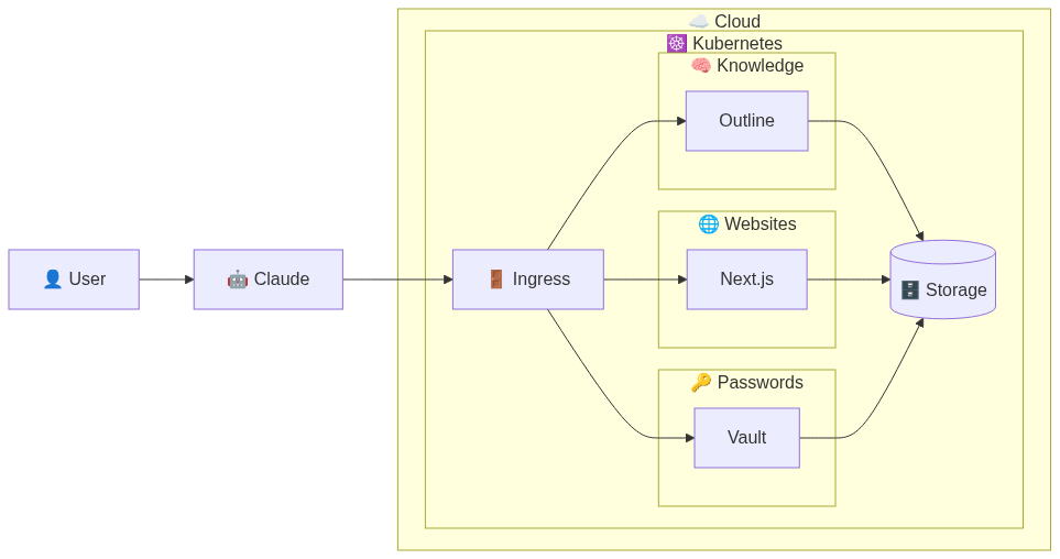
Three namespaces, Knowledge, Websites, and Passwords, each isolated from the others. Shared storage underneath. Network ingress at the edge routing traffic in. Claude sits outside the cluster, calling into Ingress for all content operations.
The complexity here is real, and none of it is ornamental. Each namespace exists because something has to be isolated. Ingress exists because traffic has to land somewhere it can be reasoned about. Storage sits below because state has to live somewhere the rest can borrow it. All of it stays inside the box marked Kubernetes. The larger system still sees a single component, the same way three diagrams ago the whole writing stack was just "Cloud."
There's a second reason to draw it this cleanly, and it isn't for the humans. A diagram this explicit about direction and boundaries is something Claude can read and orient to, the same way a new engineer would on their first day. The arrows say what talks to what. The subgraphs say what lives inside what. Get that right and the diagram stops being decoration and starts being close to a spec, an artifact you can hand off and have acted on rather than merely admired. That is a whole post of its own, and it's coming.
Have you decided where this is going yet?
The namespaces, the ingress, the Vault token, Claude pulling credentials at runtime: none of it disappears, it just stops being your problem at the top level. Encapsulation is the whole move, the same one that let "Cloud" stand in for an entire writing stack earlier. It is still just this, a MacBook and a server. Start with two boxes, orient yourself to what they mean, and only then decide to add one more, then another. The more robust diagrams above are the result, built the same way, each one placed because it had a reason to be there.
Bringing It All Back Home
The Architecture Diagram from Hell gets built one box at a time too. The difference is nobody stopped to ask where they were going, so every box arrived all at once and no one could say why.
Do the opposite. Orient first, and the acting takes care of itself, because every box you add lands somewhere you actually chose to go.
After all, as the Cheshire Cat says, if you don't know where you are going, any road can take you there.